Platform Tips
Caption Readability Checklist for Short Videos
A checklist for captions people can read on a phone: WCAG contrast ratios, size, line length, timing, safe zones and the trade-offs of burned-in captions.
Readable captions need enough contrast, a size you can read at arm's length, short lines, timing that follows the speech and a position clear of app controls. Burned-in captions are always visible but cannot be switched off.
Most short-form viewers see your video on a phone, often in bright light, often with the sound off. Captions are the way the message reaches them, so legibility is not a decoration problem; it is a delivery problem.
This checklist uses the web accessibility guidelines for contrast as a measurable baseline and adds the practical rules that matter for vertical video.
1. Contrast
The Web Content Accessibility Guidelines (WCAG 2.2), success criterion 1.4.3, require a contrast ratio of at least 4.5:1 between text and its background, or 3:1 for large text (at least 18 point, or 14 point bold). The criterion applies to text and to images of text, and it does not carve out captions as a category. It is written for web content generally and says nothing specific about video, and its exceptions (incidental text, logotypes, and text that is part of a picture containing significant other visual content) leave room for interpretation when captions sit over moving footage. Whether a given video falls under a conformance claim, and whether its captions qualify for an exception, depends on your context and is not something this article can decide. What the ratio does give you is a measurable target for burned-in words. Because the background changes from frame to frame, a caption that passes over one scene can fail over another, so one frame is not enough evidence. The criterion is published at the W3C as WCAG 2.2, Success Criterion 1.4.3 (Contrast, Minimum), with a longer explanation in the W3C's Understanding document.
- White text over a busy photograph often fails, because some regions of the image are bright. Where your tool allows it, a dark outline or a semi-opaque band behind the text can help; with a fixed set of presets, as in Kineclip, you choose the preset and art style that read best instead.
- Check against the brightest and the darkest frames, not an average one.
- Coloured text on a coloured background can look fine on your monitor and fail on a phone. Use a contrast checker if you are unsure.
2. Size
- Hold your phone at arm’s length. If you cannot read the captions comfortably, they are too small.
- Larger is not always better: text that fills the screen hides the image and forces many short caption chunks.
3. Line length and chunking
- One to three words at a time, or a short phrase of at most two lines, is easy to take in at speaking speed.
- Break phrases where a speaker would pause, not mid-phrase.
- Never let a caption block overflow the width of the screen; check the longest word in the script.
4. Timing
- Each word or phrase should appear as it is spoken, not before or well after it.
- Every caption stays on screen long enough to read. Fast chunks help energy, but flashing too quickly makes people read ahead and lose the thread.
5. Position and safe zones
Platform interfaces cover parts of the frame: buttons on the right, the caption bar and account name at the bottom, the search bar at the top. Keep captions inside the area that stays clear. The vertical video and safe zone guide explains the layout in detail.
6. Accuracy
- Captions match the narration word for word, including names.
- Numbers appear the way a viewer expects to see them, even if the voice speaks them as words.
- Check punctuation that changes meaning, such as a missing question mark.
Kineclip’s caption presets
When you create a series you choose one of four caption styles, shown with a preview before you commit.
| Style | What it looks like | When it suits |
|---|---|---|
| Bold Center | Large, centred captions | Fast, high-energy content where captions are the focus |
| Minimal | Clean, subtle captions | Calm or elegant visuals you do not want to cover |
| Impact | High-visibility, dramatic | Dark, busy or high-contrast imagery that needs strong separation |
| Compact Top | Small, positioned at the top | Visuals with important detail at the centre or bottom |
The right choice depends on your art style as much as on taste, so preview the caption style against the look you picked. The art style guide covers that choice. For a general explanation of automatic captions, see automatic captions for short videos, and for the tool itself, the AI captions generator page.
Burned-in versus separate caption tracks
Kineclip exports videos with captions burned into the picture. That has real advantages: they are always visible, they work on every platform and no one has to enable them. It also has limits. The viewer cannot turn them off, change their size or translate them, and assistive technology cannot read them. Where a platform supports uploading a separate caption file, that is a complement worth considering on videos you care about; check the platform’s help pages for how. Do not rely on a platform’s automatic captions alone, as these can contain errors.
Include a quick caption check in your regular review. The pre-publish checklist shows where it fits.
Frequently asked questions
What contrast ratio should captions have?
WCAG 2.2 success criterion 1.4.3 asks for a contrast ratio of at least 4.5:1 for normal text and 3:1 for large text. The criterion covers text and images of text, and it does not exempt captions as a category; it also has exceptions (for example incidental text and text that is part of a picture with significant other visual content), and how they apply to burned-in captions over footage is a judgement we do not make for you. Treat the ratio as a target for readability, not as a compliance finding.
Are burned-in captions accessible?
They help viewers who watch without sound and many who are hard of hearing, and they are always visible. They cannot be turned off, resized or translated by the viewer, and screen readers cannot read them, so a separate caption track is more flexible where the platform supports one.
Which Kineclip caption style should I choose?
The presets are Bold Center, Minimal, Impact and Compact Top. Bold Center and Impact favour readability at a glance, Minimal is subtler, and Compact Top uses smaller text in the upper part of the frame. Preview each against your art style before settling on one.
Do captions need to match the voice exactly?
They should, because a mismatch between what is heard and what is read is distracting and can change the meaning. Include a caption check in every review.
See what a series looks like
How Kineclip helps
Kineclip handles the tactics in this article automatically — vertical format, optimal length, captions, scheduling, and consistent daily posting.
Try Kineclip's series workflow →Related articles
Platform Tips
Flashing, Strobing and Motion: A Safety Guide
What the WCAG three-flash threshold says, which short-video effects risk triggering photosensitive reactions, and how to review AI-made videos for them.
Platform Tips
YouTube Shorts Upload Checklist for Faceless Creators
What to check on YouTube before and after a faceless Short goes live: length, format, the altered-content setting, title, description, visibility, monetisation.
Platform Tips
TikTok Inbox Drafts, Explained for Creators
What it means when a tool delivers a video to your TikTok inbox as a draft: why it exists, what you do next and how it differs from auto-posting.
Make videos like these with AI
40+ viral templates — ASMR, talking characters, POV and more. Pick one and see a real sample in seconds.

✨ Impossible ASMR

🔮 Glass Fruit Cutting

🍜 Food Summon Jutsu

🐶 Talking Animals
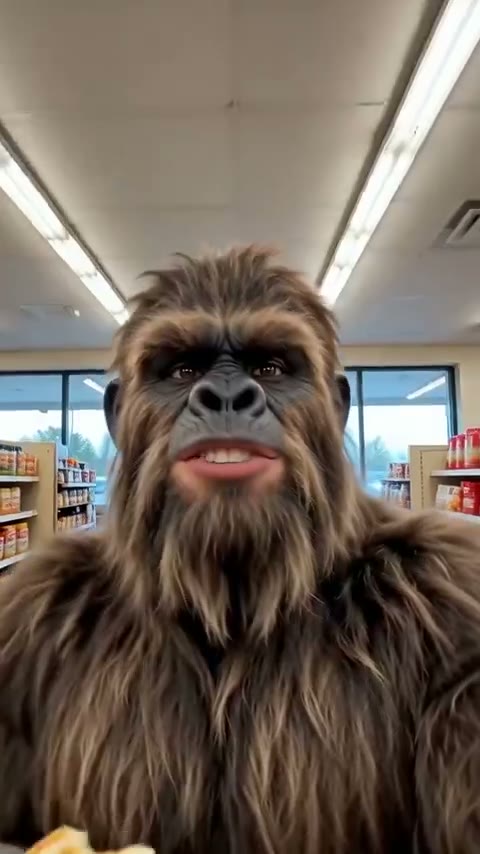
🦶 Cryptid Vlog
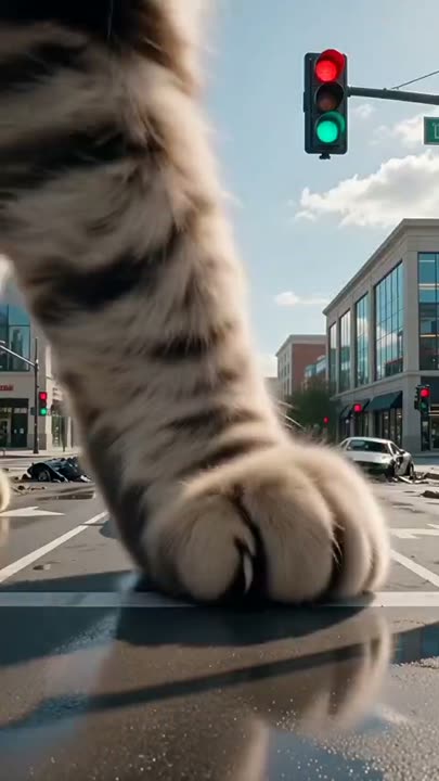
🏙️ Giant Encounter
Now automate it — see a real sample of what it posts, free
Watch a real sample video free. No credit card required.
Watch it free